Friday, December 26, 2008

Christmas Gifts & Illustrating Character

Did everyone have a wonderful Christmas? I received a pinwheel block from my nine year old daughter. She hand stitched it without any help, and I have instructions that I may finish it with quilting. I think I might make it a bit larger and turn it into a dresser scarf.

This month’s Fast Friday Challenge, we are to work with “zinger” colors, and illustrate a mood or emotion with the piece we create. I know I can easily add some zinger colors to a succulent piece, but how can I express emotion?

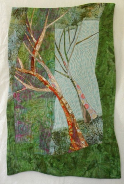
Verticals, branches reaching towards the heavens, sunbeams reaching down, rising bubbles, all seem of joyful. I nearly always choose to work in a vertical format even when my subject is a landscape. Last January, I did a digital experiment to stretch one of my vertical landscapes into a horizontal. The horizontal version seems more peaceful and spacious, and the water and horizon seem to have more emphasis. I prefer the vertical version where the emphasis seems more on the tree and the upward reaching branches.

So, perhaps this month’s succulent quilt will feature flower stalks reaching upwards.

I have been working rather precisely lately, tracing photographs to lay out main shapes before I begin to paint and quilt my succulent pieces. Perhaps I should try cutting or drawing freehand shapes to see if this will add character to my succulent series.

How do you express emotions or add character to your quilts or other artwork?

Thursday, December 18, 2008

Paying Attention to Value

Elizabeth Barton gave excellent advice about using value on her blog a couple of months ago. She also said quite a bit about value in this blogpost in which she says, “Check your value patterns – the deepest darks should create an interesting shape overall as should the brightest lights. It’s often easiest to see this by either squinting, or by taking a photograph, putting it intoPhotoshop and desaturating the colour. When it’s in black and white the value pattern becomes quite evident.”

I had Elizabeth’s advice in mind when I was searching for a photo to use for the latest succulent quilt.

I rejected a lot of photos, because the lights and darks just looked scattered and didn't interest me. One of the reasons I liked this photo was because the two large leaves in the upper right are relatively dark and create a diagonal balanced by the dark area at the bottom left. I was planning on emphasizing the values when I did my painting.
However, now that I compare my finished quilt to the original photo, I think I forgot my original thoughts. Black and white photos do help in seeing value without being distracted by color. I like how my final quilt came up, but the shading is very different than the photo. I was perhaps a bit stingy with the white paint as I was finishing for fear of overdoing it.

I have a second piece in progress using this photo. I will pay more attention to my original inspiration this second time.

Saturday, December 13, 2008

Succulent II

Succulent II is based on a very close cropped photo of a succulent. It is for a Fast Friday challenge to work with either a close view or a far view with the focus on value. The base cloth is the clean-up fabric that I posted about last week. The patterns and colors in the original cloth have nearly disappeared beneath more paint and stitching, but bits of the original fabric still peek through. Working with this fabric helped free me from the need to interpret the colors from the original photo literally, and let me focus on value.

Sunday, December 7, 2008

Clean-up Cloths and Succulents

You can lay painting projects on top of plastic sheeting when you paint, and use paper towels to wipe the paint out of brushes between colors. But it’s more fun to lay work on top of another piece of fabric, and use the edges of the cloth underneath to clean the brush. If there’s leftover paint on my pallet, I sometimes get out stencils and decorate the cloth some more. I’ve been using this fabric for a drop cloth and clean-up rag for a year or more now.

Another two succulent quilts are in progress. I chose a closer cropped view of the center of a succulent plant for this month’s Fast Friday theme “Close Up or Far View” with a focus on “Value”. I believe cropping the succulent this close will make it seem more abstract.
I decided to try this composition twice. Once with a fabric fairly close in color to the actual plant, and once with a corner cut from my old drop cloth and clean-up rag. I think I need to balance the colors with some more stenciling, before I begin painting to define the succulent form.

Tuesday, December 2, 2008

“Trees Are Us” Exhibit

The following three pieces have been selected to be part of an exhibit at the Solovei Art Gallery in Everett, Washington. I expect there will be a wide variety of mediums represented.

Artist reception on Saturday December 6th 2pm - 6pm. It will be running until December 29th. The location is 2801 Grand Ave, #203, Everett WA 98201. Look for more information about the Solovei Art Gallery on their website: http://www.soloveiartgallery.com/


Saturday, November 29, 2008

Christmas Stars Completed

I have finished sewing the stars.

I got tired making gold stars, so a few of the gold stars turned red and a few green.

The winners of my giveaway drawing are Chris and Doreen.

Chris has some nice quilts on her blog. I particularly like her Zinnia quilt.

Doreen looks like she has been having fun with her Embellisher felting machine. That’s something I’ve no experience with, but it’s fun to see what other people are doing with it.

Tuesday, November 25, 2008

Progress on the Gold Stars

The golden colored stars are about half done. I expected the metallic in the gold paint to show up a bit more. It's very bold in the jar, but looks rather subtle brushed lightly onto the stars.
The day before Thanksgiving seems an odd day to have a drawing. I will pick the names on Friday or Saturday after Thanksgiving. So you have until then to leave a comment on either this post or the last post if you would like to have your name in the giveaway drawing. I am enjoying reading your comments and visiting your blogs.

Wednesday, November 19, 2008

A Blogiversary Giveaway

It’s been a year since I started blogging! I wasn’t sure if I would like blogging, or if I would keep at it. But I have enjoyed the process, and I have made a few online friends. I often wonder who my readers are. Leave me a comment if only to say “Hi,” or share what kind of projects you are creating for the holidays. I am making Christmas stars. In one week, two lucky people will be drawn from those who leave comments on this post to receive one of the stars I am making.

I have begun quilting the orange-yellow fabric for the golden stars. I darkened the color a bit on the already quilted stars, and I may go back in with the darker paint after it is dry for a less even look. After the stars are sewn and finished, I intend to add highlights with lighter colored and metallic paint like I did for my “Succulent” quilt.

I used some of the green fabric to try out a few construction techniques, so I could get the look I am after without too much fuss.
Turning it like a pillow was near impossible with the thick quilted fabric. Light stuffing with extra stitching year the inside corners gives a nice dimensional look. I tried paint on the edges to disguise the raw edges, but prefer how couched yarn looks.

Saturday, November 15, 2008

Christmas Project

Yesterday I painted some fabrics in a golden yellow color for a Christmas project I have in mind. A bit of bronze metallic paint was added for just a bit of shine. I think I will get a lighter gold metallic paint to add highlights to the finished product after they are quilted.

This experimental bit of fabric has been sitting around for over five years. It is strips of fabric and embroidery floss laid atop a rectangle of green fabric, topped with a piece of green tulle, and free-motion stitched. It’s about time to see what I can do with it.

Thursday, November 13, 2008

Clam Cove III Revisited

I have addressed most of the problems I was having with this piece. It still is not my favorite piece, but I think it is improved.

Wednesday, November 12, 2008

Learning from Less Successful Work

A wise workshop instructor once asked me why I didn’t like a particular exercise I did. The moment she was talking with me, I thought she was implying that the work wasn’t so bad, because I didn’t hear her emphasis on the word “Why.” Later that day, I realized that she was just trying to make me think, so that I could learn from my mistakes instead of just tossing them aside. And I probably learned more from the one bad piece in that workshop than I did from the other better pieces I did the same day.

Okay, so why exactly don’t I like the Clam Cove III piece from my last post. I have thought about it some and now I will think about it a bit more, and try to clarify my thoughts. Thank you, Sylvia, for reminding me how important the thinking part is, and encouraging me not to give up on this piece.

The seaweed clumps are the most dominant part of the composition. They don’t look naturally laid out. They are too evenly spaced, almost like a grid across the piece. The clump near the bottom should be the largest since it is in the foreground, but it seems to be the smallest.

The rocky beach is nearly the same color and shade as the water. It needs more contrast and definition because it is in foreground.

The time is early evening. When I was standing on that beach, I was enchanted by the way the setting sun was making everything glow. I should have used a warmer color in place of the pale cool yellow used to highlight the rocks in the foreground and the piers in the back.

The water looks flat. Maybe I could make it more interesting and natural looking by varying the color more.

Perhaps I shouldn’t have picked a photo with so much detail. The technique I am working with seems to work better with simpler shapes.

I have made a few changes this morning. I will look at it with fresh eyes tomorrow after the paint has dried, and decide if I will make any more changes.

Tuesday, November 11, 2008

Succulent – The First in a Series

Succulent
10 x 13½

May I dare to call this a series when the rest exist only in my mind? Anyway, the first is done. And it is as I imagined it to be when I first began the painting and quilting a week and a half ago. I will make more quilts similar to this one.

Monday, November 10, 2008

Getting Ready to Paint Again

I have my latest two pieces quilted, and am ready to add more paint.

I want to finish the Succulent piece, and forget about the Clam Cove piece which I don’t think is as successful. But I guess I better finish the Clam Cove piece first so I can see what I can do with it, and to give me practice for the Succulent piece.

I am a bit hesitant to start adding more paint to either piece, after so much time spent heavily quilting them. I guess I better just do it, and hope it looks like the finished work that is in my mind.

Friday, October 31, 2008

The Beginning of a Succulent Series

The Fast Friday Challenge for this month was announced a week ago, and I got a late start. This month, we are to do something monochromatic and use perspective in designing our piece. I have some thoughts for perspective with a Sea Glass piece, but don’t want to only use one color, so I decided to start a new series.

This close-up of a succulent seems to show perspective well. I converted the photo to greyscale and increased the contrast so I could concentrate on line and value.

A medium green-blue fabric was selected, and a line drawing stitched on it in the same manner as for Clam Cove III which is still in progress.

These shapes are mostly larger and simpler than the ones in Clam Cove III. I thought again that I would cut different values of fabric shapes to define the leaves, but I changed my mind again and decided that this piece needs paint.

I used my Setacolor transparent paints to add the darker values in the image. I went back after I took this photo to make the darkest darks just a bit darker.

There’s something to be said for turning your work upside down while drawing or painting. I did just to keep my hand from smudging the wet paint, and almost immediately noticed the whole leaf and a half that didn’t get sewn with thread. I sketched it with pencil before I continued and stitched the last few lines after I did the painting.

My thoughts are to layer and quilt, before I go back in and add highlights with white or another light valued paint. I am hoping to achieve the same textured look like I did on Coyote Hills Marsh.

Thursday, October 23, 2008

Clam Cove III – heading in a new direction

I have begun painting on my latest project to define the details.

I haven’t followed the original plan to add fabric shapes to define the scene since there are so many small detailed shapes. So I will continue on this different path that the project is taking me, and see what I can do with it. It’s progressing slowly, because I have only been working on it 20 or 30 minutes at a time when I can fit it into my schedule.

I plan to define the trees in the background next and will add some highlights to the water. Although it may get put on hold a week or so since the Fast Friday Fabric Challenge will be announced late tonight.

Monday, October 20, 2008

Clam Cove III

I am trying out a new technique I adapted from an article in the Aug/Sep 08 issue of Quilting Arts magazine.

I have returned again to my Clam Cove photo. I traced parts of the photo onto lightweight interfacing, and layered it behind a front fabric with batting. I used the tracing on the interfacing to add free-motion stitching. Most of this has been stitched twice, because my first choice of thread color matched the fabric too much and was rather weak looking. The photo is a detail of the piece in progress.

My intention was to go back with lighter and darker fabrics to emphasize the image more. Now I think I will try paints instead, perhaps with fabric accents.

Friday, October 3, 2008

Sea Glass III

My Fast Friday Group has chosen to focus on composition and color, instead of picking a theme or topic each month, and is encouraging us to work in a series as we complete our monthly challenges.

I have decided to continue my Sea Glass series which I began a couple of months ago. I don’t know if there are a dozen in me, but I will wait and see where it takes me. I have also been thinking about doing a series based on the succulent plants in my garden. Maybe I will work on two series, and pick which one fits the challenge better each month.

This month our challenge was to work in a complementary color scheme with a vertical, horizontal or diagonal format.

Sea Glass III (9½ x 13) uses green and red as complementary colors. Green is one of the more common colors of sea glass (consider what colors beer and wine bottles commonly come in). Red is one of the least common. I’ve taken some artistic license and included some light pink. I’m guessing pink is more rare than red sea glass in the real world.

My original idea for a diagonal composition wasn’t working the way I had intended, and so I played with shapes until this spiral emerged. Does the small curve at the bottom help make this a diagonal composition? Perhaps this would qualify more as a circular composition.

Wednesday, September 24, 2008

Clam Cove II – Finished Again

There was a suggestion on the Fast Friday Blog to add some darks to the water area to help with the balance of this piece. I decided to act on the suggestion add just a bit of dark to the water area.

I’m not sure about how this affected the balance, but I think it has added some dimension to the middle section and unified it more with the rest of the piece.

Thursday, September 11, 2008

Learning to Machine Quilt

I was a featured artist at the Piecemakers Quilt Guild show in May, and gave a short talk to a few groups of people that weekend. I was surprised and pleased to get an email today from Chris Crawford who came to here me speak. She says I gave her the inspiration to try some new things. Take a look at Chris’s blog to see some of her early attempts at free-motion quilting. It’s looking great Chris.

I did a lot of hand quilting, and some quilting with the feed dogs down for about 10 years before I got brave enough to try free-motion quilting. My problem was that I didn’t think I could ever make my quilting look as good as the expert examples in books and magazines, and I imagined that it would be very difficult. And then one day I saw a quilter demo a free-motion feather design. She made it look so easy, I decided I would try it on a small sample and see what I could do.

My first attempt at free-motion was on a small piece of fabric about eight years ago. I quilted a free hand feather design and then filled in the empty space with stipple quilting.

The first bits of stippling were very jerky, but the time I finished stippling the whole piece, I had the rhythm down and it was becoming easier.
I finished it as an 11 x 16 doll quilt for my then one year old daughter.

The progress I made on the first piece made me realize that I could do free-motion work, and that I could get better with practice. I decided it was good enough that I could tackle a larger piece, so I put together the blocks from the Piecemakers’ Block of the Month drawing that I had one into a 46 x 75 quilt, and free-motion quilted an allover pattern.
This is a well used quilt, as it is the perfect size to make just my side of the bed a few degrees warmer.

Monday, September 8, 2008

Completed Abstract Project

Clam Cove II (15" x 10½")
A few more minor changes to this piece this weekend, and then completed the quilting today. I have been reminded again how important contrast is to the success of a piece. I seem to be learning this lesson over and over again.

Thursday, September 4, 2008

Progress on Abstracting a Photo

My initial attempt at this piece didn’t excite me. Too many small pieces, no defined focal point, and not enough contrast. Adding some abstracted trees and a dark line near the horizon helped with the contrast, but didn’t relate to the rest of the piece.

I’ve added some dark neutrals to the bottom to create a foreground. Now I think I have enough contrast, and it seems to relate to the top shapes. I may put it up on the wall to think about for a day or two.
Names often stump me. Any ideas?

Friday, August 29, 2008

Abstracted Garden Challenge

This month’s Fast Friday Challenge – create an abstract based on a photo of a garden. I’m getting started a bit late, as the guidelines for this month were announced last Friday, but I suppose now is as good a time to start as any.

I have wanted to create another piece based on this photo. Is it too much of a stretch to call this a water garden on a grander scale? Anyway, I've decided to use this photo again.

The original quilt I made from this photo is blogged about here: A Bag of Stuff, Sérusier, & a Thought for a New Quilt.

A year after I made the original Grab Bag Quilt, I made this whole cloth painted silk piece. I’ve never quite decided how I feel about this one. It ended up a bit more surreal or other-worldly than I had originally intended.

So now I will make a third attempt at abstraction with this photo. Now I need to go cut some fabric and see if I can make it look as good as the image in my mind.

Thursday, August 28, 2008

Final Rusting Results

I am happy with how these turned out.

I may pull out the smaller piece again at some other time to add another layer of design and color, but for now I am done with rusting.

Now I need to find something to wrap the rusting stake in, so I can store it safely in my work area for the next time I get the urge to add rust to fabric.

Tuesday, August 26, 2008

More What I Expected

My second attempt at rusting was more successful. I peeked yesterday and saw definite rusting on the fabric, and then left it another day to be sure I was getting good results. Today I soaked the fabric in salt water and washed it. I like the textured look that resulted.

I wrapped it once more to fill in some of the empty spots. So now I am back to waiting until Thursday, and then I will peek again. These photos are the wet fabric. I expect the finished fabric will appear a bit lighter in color.

Sunday, August 24, 2008

Where’s the Rust?

Yesterday I peeked under the plastic at the fabric I started rusting. The string tying the fabric to the stake had turned orange, so I guessed the rust had done it’s job. But when I undid everything, there were hardly any marks on the fabric. Not even worth a photo.

The stake originally had some kind of black paint or other coating on it. Perhaps it hadn’t weathered off enough. Or maybe I scrunched the fabric up too much so that not enough of it was in contact with the rust.

So today I scraped off some of the remaining coating from the stake and rewrapped the fabric around the stake with a bit less scrunching. I will give it a few days this time before I peek.

Friday, August 22, 2008

Rusting Fabric

Rusting fabric seems to be very popular right now among fiber artists. I hadn’t given it much thought until this morning when I found a forgotten iron stake rusting in the flower bed. It was the perfect opportunity to try rusting my own fabric.

I selected a few pieces of fabric, tied them around the pole, soaked the tied fabric in vinegar, and wrapped it in plastic. Halfway through the process, I did a bit of internet searching to find out if I was doing it right. Kimberly Baxter Packwood has a great how-to and Q & A pages on rusting on her website. She recommends letting the fabric sit 24 hours before neutralizing the fabric. I wonder if I want to let mine set a bit longer since my metal wasn’t very rusty when I started. However, I don’t want to wait so long that the fabric rots away either.
Reading Kimberly’s Q & A page, I learned that rusted fabric is not archival. The rust will bond with the fibers and continue to rust indefinitely. How long does it take rust to actually eat a hole in fabric? Perhaps I need to be careful how I use rusted fabric in my quilted art pieces. I suppose it depends on how rusted a piece of fabric is, and whether a few holes will matter artistically and structurally.

I will show the fabrics again after I have untied and washed them.

Saturday, August 9, 2008

Completed Sea Glass Quilts

Sea Glass I & II
9 x 12½
I was concerned that the dense quilting in the white areas would make the “glass” part of the quilt pucker. A heavy interfacing behind the batting seems to have worked well to prevent this.

Thursday, August 7, 2008

Swimsuits & Thread

August is NOT a good month to buy a swimsuit. Spent most of yesterday shopping with my daughter to find a swimsuit in the right size that she likes (which isn’t an easy job at the end of summer with them all picked through.) Why did her bathing suit get a hole in it one day before swim lessons were over? But that’s okay, we might do some more swimming this summer, and it should fit next summer too. Now I’m tempted to go see if I can find a new suit for myself since the prices are so good.

I decided on white thread for the Sea Glass quilts, and then couldn’t do any quilting when I realized I was out of white thread. After I finally got out shopping and came home with white thread, I changed my mind and outlined each piece loosely with variegated light blue which I already had.

I’ve only quilted through the top and backing so far, so I could decide whether I want to bind it or do a pillow case finish. After I add the backing, I will do some more quilting with white on the background.

Tuesday, August 5, 2008

Sea Glass in Progress

Sea glass I and II are arranged and fused onto white fabric. I need to decide what to do about quilting. My original thought was to outline the shapes loosely with dark thread. My thoughts now are that dark thread could overpower the softer colors. The first on especially needs something to add interest, but I am afraid of adding too much.

Sunday, August 3, 2008

Sea Glass & More Community Quilts

I’ve got lots more fabric leftover from the bag of fabric that was given to me. I had enough flannel scraps leftover for a tiny quilt. Our guild donates small quilts to hospitals for preemie babies.
I have also started piecing together some of the Christmas fabrics which were in the bag. Christmas quilts often get chosen first by kids even when it’s not Christmas.


This months Fast Friday Fabric Challenge is to make a quilt with the concept of “less is more” by having a relatively small focal point surrounded by lots of negative space. Or by working with the “more is more” concept by having an overall pattern with no prominent focal point.

I like to pick up sea glass when I go walking out to the small rocky beach at the end of a marsh trail in San Leandro. I had in my mind to do a “less is more” quilt with a few shapes inspired by my small beach glass collection. I cut a few more than I needed, so I would have some choices when I was arranging the pieces, and then got carried away a bit. I may decide to make a quilt for each of the options available this month.