Friday, February 28, 2014

Going Bananas

This was a final project for my design class last semester. It’s purpose is to illustrate the word “cooperation”. The monkeys are cooperating to get bananas which are being guarded by an alligator. I want to add more quilting in the background, but I don’t know when I will find the time right now.

I am currently using it again in parts in a photo montage for my Photoshop class.

I have linked up to Nina Marie’s Off the Wall Friday.

Monday, February 24, 2014

Talking Typefaces


The purpose of this project is to show how type can communicate just by the typeface chosen. This typeface is called Petal Glyph, although I think it looks more like leaves than petals. It’s interesting how you can stylize a letter this much, and yet it’s still legible.
I had originally thought I would fill the letters with a photo with Adobe Illustrator, and add a drop shadow, but decided to make it literally dimensional. The letters are cut out of white foamcore leaving letter shaped windows which are mounted a quarter inch away from a solid piece of paper painted with watercolor.

Monday, February 17, 2014

The Personality of Typefaces

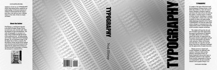
This hand lettering project for my design class took many thumbnails and rough revisions before I painted the final projected. Hopefully the final project says something about my personality, since that was a major point of the assignment.

When I get some extra time I plan to create a vector version from the final version which I can use on my website and resume.

Wednesday, February 12, 2014

Spiral & Leafy Shapes

This small quilt has changed a lot since it began. It’s beginnings can be seen two posts back on January 26. I think the design part of this quilt is done. I just need to finish the edge. I’m clueless what to name this, or if it shall remain “Untitled”. Any suggestions? I had spirals and leafy shapes in mind when I created it.

With the heavy quilting and paint, it is hardly noticeable that the areas of color are made up from tiny scraps, but up close, it adds to the layered look.


I have linked up to Nina Marie's Off the Wall Friday.

Tuesday, February 11, 2014

The Green Eyed Monster

I am taking another semester of graphic arts classes this semester. I will show some of my finished projects.

For this Photoshop assignment, we could only use photos supplied by the instructor, and told to cut and paste fruits and veggies to create a “Veggie Guy.” I tried to have a little fun with mine. Here he is running away from a fork which is made from a Photoshopped parsnip.


A book dust jacket created for a different class:


For the front of the book, we could only use the word “Typography.” I repeated the word over and over to form a background texture. I ran into difficulties getting the look I wanted in Illustrator and InDesign, but finally got the look I was after using Photoshop. By using a gradient to color the text and a different gradient for the background I able to create a subtle texture which adds interest by fading in and out.