Showing posts with label photoshop. Show all posts
Showing posts with label photoshop. Show all posts
Sunday, June 17, 2018
Digital designing
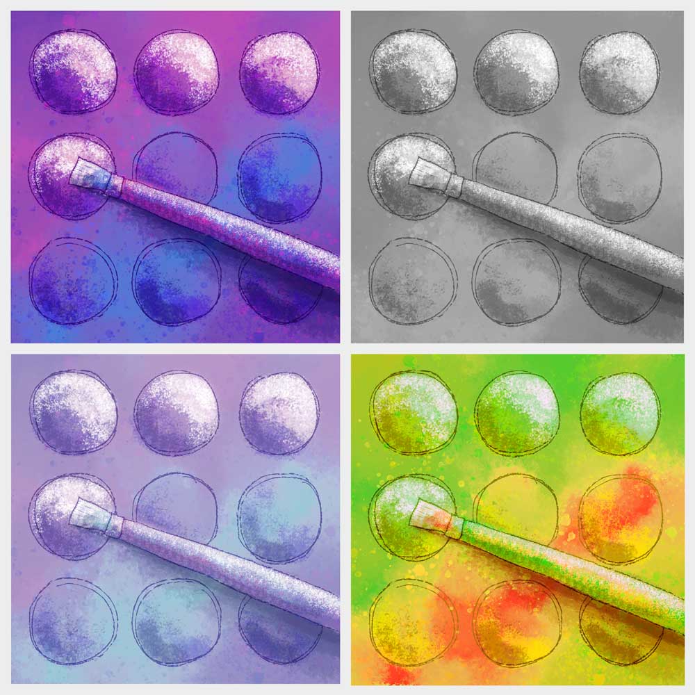
Created a new quilt design for a challenge to illustrate a favorite quilting tool. I have chosen a paintbrush, because I love to combine my art tools with my quilting. Decided to try it out first in a digital format. Started with my "safe" colors (bright purple and blue) then tested some other colorways. I can't decide which I like best. Which one is your favorite?


Saturday, May 24, 2014
A lesson in “Hand Written” fonts
I had an interview for a summer internship yesterday, and got some great advice on the font choice used on one of my portfolio pieces.
For my final project for a design class, I chose to do an ad for my favorite pair of sandals. Since hand drawing at least part of the ad was a required element, I had the idea to create the ad around a woman who likes to hike, and likes to write and draw in her art journal. Nearly all of the text for the ad was written in the journal, and I chose a font called “Segoe Script” (shown in left sample below) because it looked like hand writing, and would give the casual feeling I was trying to achieve in the advertisement.
 The problem with using a font to represent handwriting, is that it’s a little too perfect. Escpecially for large amounts of text with repeating letters, it’s quite obvious that it was typed on the computer. It’s usually better if you want to represent handwriting to actually write it out by hand (right sample).
I’m much happier with this project now that I’ve made this change. The images I created are all black and white drawings which I scanned into Photoshop. I used the Brush tool and the Mixer Brush tool to “paint” the images in Photoshop. This was the first time I used the Mixer Brush tool, and I found it to be alot like blending two colors of wet paint together with a brush.

For my final project for a design class, I chose to do an ad for my favorite pair of sandals. Since hand drawing at least part of the ad was a required element, I had the idea to create the ad around a woman who likes to hike, and likes to write and draw in her art journal. Nearly all of the text for the ad was written in the journal, and I chose a font called “Segoe Script” (shown in left sample below) because it looked like hand writing, and would give the casual feeling I was trying to achieve in the advertisement.
I’m much happier with this project now that I’ve made this change. The images I created are all black and white drawings which I scanned into Photoshop. I used the Brush tool and the Mixer Brush tool to “paint” the images in Photoshop. This was the first time I used the Mixer Brush tool, and I found it to be alot like blending two colors of wet paint together with a brush.
Wednesday, May 21, 2014
Rowell Ranch Rodeo Parade
A couple of weekends ago I went to the Rowell Ranch Rodeo Parade in Castro Valley so Camilla could hand out tote bags and flyers for her school. I went with my camera to take lots of photos and get inspiration for a final project for my Photoshop class. I got frustrated trying to put many photos together to represent parade and community and not just the rodeo. My initial efforts looked very cluttered and busy, and didn’t have any focus.
Going back to planning stage, I decided I could make an effective poster with just words. I picked a simple background drawing, and then focused on how to arrange the words for good visual impact. The parade has been around for over 90 years, so I had the idea to make a vintage looking sign. I gave it further character by placing a photo of some old boards you might find on an old ranch (actually my backyard fence) behind the image, and then blending the two with many layers.


Going back to planning stage, I decided I could make an effective poster with just words. I picked a simple background drawing, and then focused on how to arrange the words for good visual impact. The parade has been around for over 90 years, so I had the idea to make a vintage looking sign. I gave it further character by placing a photo of some old boards you might find on an old ranch (actually my backyard fence) behind the image, and then blending the two with many layers.
Sunday, March 23, 2014
Going Bananas Revisited
I used parts of my last quilt in a Photoshop collage for my Photoshop class.

I began with a photo I took in Garin Park up in the Hayward hills. A hand drawn door was “painted” in Photoshop which opens into an alternate universe where quilted monkeys are trying to reach the bananas. The open door has drawn the quilted alligators out from hiding. The squirrel and the sky behind the monkeys are public domain photos I found online. And the sunbeams coming out from the door are a vector illustration I drew in Illustrator.
It was fun combining these different styles into a new project.
I began with a photo I took in Garin Park up in the Hayward hills. A hand drawn door was “painted” in Photoshop which opens into an alternate universe where quilted monkeys are trying to reach the bananas. The open door has drawn the quilted alligators out from hiding. The squirrel and the sky behind the monkeys are public domain photos I found online. And the sunbeams coming out from the door are a vector illustration I drew in Illustrator.
It was fun combining these different styles into a new project.
Tuesday, February 11, 2014
The Green Eyed Monster
I am taking another semester of graphic arts classes this semester. I will show some of my finished projects.
For this Photoshop assignment, we could only use photos supplied by the instructor, and told to cut and paste fruits and veggies to create a “Veggie Guy.” I tried to have a little fun with mine. Here he is running away from a fork which is made from a Photoshopped parsnip.

A book dust jacket created for a different class:
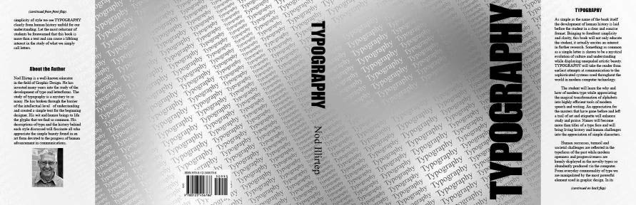
For the front of the book, we could only use the word “Typography.” I repeated the word over and over to form a background texture. I ran into difficulties getting the look I wanted in Illustrator and InDesign, but finally got the look I was after using Photoshop. By using a gradient to color the text and a different gradient for the background I able to create a subtle texture which adds interest by fading in and out.
For this Photoshop assignment, we could only use photos supplied by the instructor, and told to cut and paste fruits and veggies to create a “Veggie Guy.” I tried to have a little fun with mine. Here he is running away from a fork which is made from a Photoshopped parsnip.
A book dust jacket created for a different class:
For the front of the book, we could only use the word “Typography.” I repeated the word over and over to form a background texture. I ran into difficulties getting the look I wanted in Illustrator and InDesign, but finally got the look I was after using Photoshop. By using a gradient to color the text and a different gradient for the background I able to create a subtle texture which adds interest by fading in and out.
Tuesday, December 15, 2009
A few more Photoshop projects
A tinted black and white photo, and the same photo colored with Pantone color spots.

 The product and brand on this Photoshop label are completely made up:
The raspberry photo I used on the label is by Stuart Whitmore. It is a free photo downloaded from http://www.morguefile.com
The label I created was turned into a 3d object for use in this advertisement for my final project:

The chocolate cake photo is by: Clara Natoli. It was also a free photo from http://www.morguefile.com.


 The product and brand on this Photoshop label are completely made up:
The raspberry photo I used on the label is by Stuart Whitmore. It is a free photo downloaded from http://www.morguefile.com
The label I created was turned into a 3d object for use in this advertisement for my final project:

The chocolate cake photo is by: Clara Natoli. It was also a free photo from http://www.morguefile.com.
Monday, November 2, 2009
Composite Photo of Alviso

 My current Photoshop project was inspired by two photos from a photo excursion in the Alviso neighborhood of San Jose. Two buildings on neighboring plots caught my attention: a well kept Victorian house, and an old run-down business of some sort with the name “Skin Deep.” I decided to move the two buildings closer together.
  A bit of web surfing revealed that this is the Tilden-Laine house and the remains of Laine’sGrocery. I used a photo of the nearby Alviso marsh area as the background for the two buildings.
Wednesday, September 30, 2009
Innsbruck, Austria
 I'm still in California, but I enjoyed working with this photo from Innsbruck, Austria this last week.
We were given a choice of a few photos to work from for our latest Photoshop assignment. The original I chose is shown here: http://www.morguefile.com/archive/display/181026. I didn't alter this photo much at all. Mostly, I only enhanced what was already there. I selected the foreground, midground, and background separately so I could adjust the levels of each separately. And I changed the bright green shirt in the bottom corner to a dull yellow to better fit the color scheme in the rest of the scene.
Wednesday, September 23, 2009
Old Things are New Again & Dorothy’s New Dress
 Our last Photoshop project required less imagination, but taught us just how powerful adjusting the tonal range and color balance can be. We needed to start with an old photo scanned into digital format. I picked one from 1967 of my husband and his family picnicking at the Hood Canal in Washington State.
The original had a lot of scratches and spots which I was able to remove digitally. For our final project we needed to remove an object, and change the color of an object. The two boats on the left are now gone, and my mother-in-law now has a new digital dress and sweater combo. I will keep a version without the boat removal and dress change for the family album.
Friday, September 11, 2009
Tea with a Chipmunk
 Would you believe that my daughter is only about six inches tall? Or that a buffalo and a chipmunk followed us home from Yellowstone this summer to have tea with her in the Hayward hills? No, I suppose you wouldn’t. I did however have fun playing with scale in my latest Photoshop assignment. And Camilla had fun helping me act out the scene which I had imagined.
Thursday, August 27, 2009
Photoshop Portrait
 I have survived the first two weeks of school, and have completed my first Photoshop assignment. Interestingly, this Photoshop project required no photos. Our task was to create a self portrait using the editing tools in Photoshop (selection, fill, paintbrush, …), without importing any photos. It is supposed to be recognizable (but not necessarily realistic), and say something about our self.
 I used the profile photo on my blog as a reference photo, changing my hair and glasses to what they look like now. I’m not all that happy with the face, but the due date was fast approaching, and I decided it would have to do. Maybe I made the eyes too big, and maybe they could be quite a bit improved with the addition of some eyelids. And I was at a loss of how to deal with teeth.
I do like how the background turned out. I used the paintbrush tool to add “stitching”, and then placed a drop shadow behind it.
Subscribe to:
Posts (Atom)


