Showing posts with label graphic design. Show all posts
Showing posts with label graphic design. Show all posts
Sunday, June 17, 2018
Digital designing
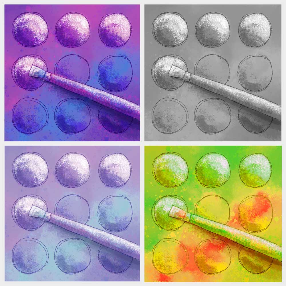
Created a new quilt design for a challenge to illustrate a favorite quilting tool. I have chosen a paintbrush, because I love to combine my art tools with my quilting. Decided to try it out first in a digital format. Started with my "safe" colors (bright purple and blue) then tested some other colorways. I can't decide which I like best. Which one is your favorite?


Saturday, May 24, 2014
A lesson in “Hand Written” fonts
I had an interview for a summer internship yesterday, and got some great advice on the font choice used on one of my portfolio pieces.
For my final project for a design class, I chose to do an ad for my favorite pair of sandals. Since hand drawing at least part of the ad was a required element, I had the idea to create the ad around a woman who likes to hike, and likes to write and draw in her art journal. Nearly all of the text for the ad was written in the journal, and I chose a font called “Segoe Script” (shown in left sample below) because it looked like hand writing, and would give the casual feeling I was trying to achieve in the advertisement.
 The problem with using a font to represent handwriting, is that it’s a little too perfect. Escpecially for large amounts of text with repeating letters, it’s quite obvious that it was typed on the computer. It’s usually better if you want to represent handwriting to actually write it out by hand (right sample).
I’m much happier with this project now that I’ve made this change. The images I created are all black and white drawings which I scanned into Photoshop. I used the Brush tool and the Mixer Brush tool to “paint” the images in Photoshop. This was the first time I used the Mixer Brush tool, and I found it to be alot like blending two colors of wet paint together with a brush.

For my final project for a design class, I chose to do an ad for my favorite pair of sandals. Since hand drawing at least part of the ad was a required element, I had the idea to create the ad around a woman who likes to hike, and likes to write and draw in her art journal. Nearly all of the text for the ad was written in the journal, and I chose a font called “Segoe Script” (shown in left sample below) because it looked like hand writing, and would give the casual feeling I was trying to achieve in the advertisement.
I’m much happier with this project now that I’ve made this change. The images I created are all black and white drawings which I scanned into Photoshop. I used the Brush tool and the Mixer Brush tool to “paint” the images in Photoshop. This was the first time I used the Mixer Brush tool, and I found it to be alot like blending two colors of wet paint together with a brush.
Wednesday, May 21, 2014
Rowell Ranch Rodeo Parade
A couple of weekends ago I went to the Rowell Ranch Rodeo Parade in Castro Valley so Camilla could hand out tote bags and flyers for her school. I went with my camera to take lots of photos and get inspiration for a final project for my Photoshop class. I got frustrated trying to put many photos together to represent parade and community and not just the rodeo. My initial efforts looked very cluttered and busy, and didn’t have any focus.
Going back to planning stage, I decided I could make an effective poster with just words. I picked a simple background drawing, and then focused on how to arrange the words for good visual impact. The parade has been around for over 90 years, so I had the idea to make a vintage looking sign. I gave it further character by placing a photo of some old boards you might find on an old ranch (actually my backyard fence) behind the image, and then blending the two with many layers.


Going back to planning stage, I decided I could make an effective poster with just words. I picked a simple background drawing, and then focused on how to arrange the words for good visual impact. The parade has been around for over 90 years, so I had the idea to make a vintage looking sign. I gave it further character by placing a photo of some old boards you might find on an old ranch (actually my backyard fence) behind the image, and then blending the two with many layers.
Friday, May 2, 2014
Inspire Oakland Billboard
I was excited to find out last night that my billboard design for ODALC’s Inspire Oakland program won 2nd place. You can expect to see it on a billboard soon.

For my design, I decided to focus on the view from Arrowhead Marsh located in Martin Luther King Jr. Park near the Oakland Airport. I imagined viewing the distant skyline from the air. Some artistic license was used in bringing the buildings much closer.
Watercolor was used to paint the view in a stylized way with bright hues, and I allowed the distant downtown to blend into the bay and marshland below. I created a second painting of my hand lettered text, and the two paintings were brought together in Photoshop.
For my design, I decided to focus on the view from Arrowhead Marsh located in Martin Luther King Jr. Park near the Oakland Airport. I imagined viewing the distant skyline from the air. Some artistic license was used in bringing the buildings much closer.
Watercolor was used to paint the view in a stylized way with bright hues, and I allowed the distant downtown to blend into the bay and marshland below. I created a second painting of my hand lettered text, and the two paintings were brought together in Photoshop.
Tuesday, April 8, 2014
Oakland Watercolor Painting

Sunday, March 23, 2014
Going Bananas Revisited
I used parts of my last quilt in a Photoshop collage for my Photoshop class.

I began with a photo I took in Garin Park up in the Hayward hills. A hand drawn door was “painted” in Photoshop which opens into an alternate universe where quilted monkeys are trying to reach the bananas. The open door has drawn the quilted alligators out from hiding. The squirrel and the sky behind the monkeys are public domain photos I found online. And the sunbeams coming out from the door are a vector illustration I drew in Illustrator.
It was fun combining these different styles into a new project.
I began with a photo I took in Garin Park up in the Hayward hills. A hand drawn door was “painted” in Photoshop which opens into an alternate universe where quilted monkeys are trying to reach the bananas. The open door has drawn the quilted alligators out from hiding. The squirrel and the sky behind the monkeys are public domain photos I found online. And the sunbeams coming out from the door are a vector illustration I drew in Illustrator.
It was fun combining these different styles into a new project.
Friday, February 28, 2014
Going Bananas

I am currently using it again in parts in a photo montage for my Photoshop class.
I have linked up to Nina Marie’s Off the Wall Friday.
Monday, February 24, 2014
Talking Typefaces
The purpose of this project is to show how type can communicate just by the typeface chosen. This typeface is called Petal Glyph, although I think it looks more like leaves than petals. It’s interesting how you can stylize a letter this much, and yet it’s still legible.
 I had originally thought I would fill the letters with a photo with Adobe Illustrator, and add a drop shadow, but decided to make it literally dimensional. The letters are cut out of white foamcore leaving letter shaped windows which are mounted a quarter inch away from a solid piece of paper painted with watercolor.
Monday, February 17, 2014
The Personality of Typefaces
 This hand lettering project for my design class took many thumbnails and rough revisions before I painted the final projected. Hopefully the final project says something about my personality, since that was a major point of the assignment.
When I get some extra time I plan to create a vector version from the final version which I can use on my website and resume.

Tuesday, February 11, 2014
The Green Eyed Monster
I am taking another semester of graphic arts classes this semester. I will show some of my finished projects.
For this Photoshop assignment, we could only use photos supplied by the instructor, and told to cut and paste fruits and veggies to create a “Veggie Guy.” I tried to have a little fun with mine. Here he is running away from a fork which is made from a Photoshopped parsnip.

A book dust jacket created for a different class:
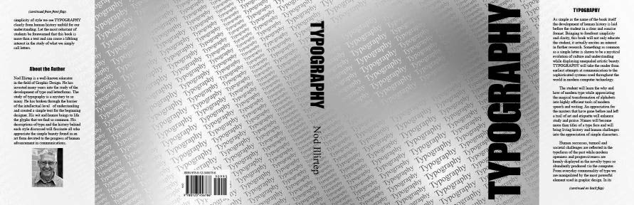
For the front of the book, we could only use the word “Typography.” I repeated the word over and over to form a background texture. I ran into difficulties getting the look I wanted in Illustrator and InDesign, but finally got the look I was after using Photoshop. By using a gradient to color the text and a different gradient for the background I able to create a subtle texture which adds interest by fading in and out.
For this Photoshop assignment, we could only use photos supplied by the instructor, and told to cut and paste fruits and veggies to create a “Veggie Guy.” I tried to have a little fun with mine. Here he is running away from a fork which is made from a Photoshopped parsnip.
A book dust jacket created for a different class:
For the front of the book, we could only use the word “Typography.” I repeated the word over and over to form a background texture. I ran into difficulties getting the look I wanted in Illustrator and InDesign, but finally got the look I was after using Photoshop. By using a gradient to color the text and a different gradient for the background I able to create a subtle texture which adds interest by fading in and out.
Friday, January 3, 2014
Coffee Cup Coasters
 Here are the results of my silk screening project. I gave some sets like these away for Christmas presents before I took any photos. Then I made another set for myself plus a few extras. I have lots of leftover prints which I thought I would give away to quilter friends.
I decided I liked the prints better on fabrics which were printed with an allover large scale print. I only had a couple of small upholstery samples, so off to the fabric store for some printed canvas.
 Not all of the words showed up well do to the problems I had developing the screen, and a few of the details have been lost from my design. But overall, I think it was a successful project and a good learning experience. I may opt to cut stencils or get thermofax stencils made for future screening projects.
Go to Off the Wall Friday to see what others have been up to this week. There are some great things up there already.

Friday, December 27, 2013
Screen Printing
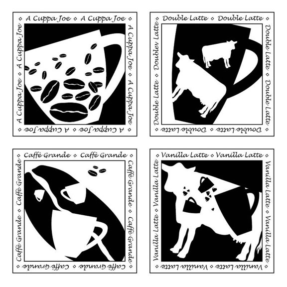
An assignment in positive/negative space left me with several designs which looked like coasters. I decided I should make coasters for Christmas presents, and the best way I could think to transfer the design was silk screen. This was a learning experience.
 My first challenge was finding a clamp on shop lamp with a high enough rating to take a 150 watt bulb. Then I had to order the correct bulb in order to follow my exposure instructions.
Next I questioned the exposure time in the Speedball instructions. 15 inches high for only 7 minutes if I have a shop reflector, but 12 inches high for 45 minutes if I use a pie pan reflector. A service rep at Speedball said that shop reflectors can vary greatly, and I should do a test before I do my expose my final screen. This website gave helpful instructions for testing exposure times. Rather than going out to photocopy onto a transparency, I used an old transparency with a small amount of typing on it, and painted numbers with acrylic paint. To make sure my paper for covering up numbers every five minutes was opaque enough, I glued aluminum foil to the back of some scratch paper. I ended up with 15 inches high for 85 minutes, and have decided the 7 minutes in the instructions has to be a typo.

After exposing it, the places where the emulsion was thicker didn’t want to rinse out, so my prints ended up somewhat spotty. I also learned that the glass holding down the transparency should cover the whole design. I thought the being a quarter inch short on the sides wouldn’t matter, but it left a line where the edge of the glass was. The courser light fabric in this photo is my drapes, and not part of the screen.
 Making the prints was a simple process in comparison to developing the screen, and went rather quickly. I made some coasters for Christmas presents out of some, and have given them out without photos. I am making a couple of more sets and will show them in another post.
Subscribe to:
Posts (Atom)


