Showing posts with label illustrator. Show all posts
Showing posts with label illustrator. Show all posts
Sunday, June 17, 2018
Digital designing
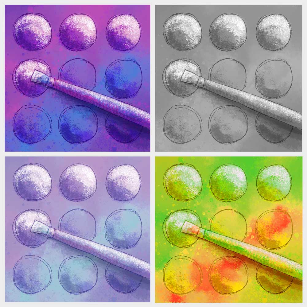
Created a new quilt design for a challenge to illustrate a favorite quilting tool. I have chosen a paintbrush, because I love to combine my art tools with my quilting. Decided to try it out first in a digital format. Started with my "safe" colors (bright purple and blue) then tested some other colorways. I can't decide which I like best. Which one is your favorite?


Sunday, March 23, 2014
Going Bananas Revisited
I used parts of my last quilt in a Photoshop collage for my Photoshop class.

I began with a photo I took in Garin Park up in the Hayward hills. A hand drawn door was “painted” in Photoshop which opens into an alternate universe where quilted monkeys are trying to reach the bananas. The open door has drawn the quilted alligators out from hiding. The squirrel and the sky behind the monkeys are public domain photos I found online. And the sunbeams coming out from the door are a vector illustration I drew in Illustrator.
It was fun combining these different styles into a new project.
I began with a photo I took in Garin Park up in the Hayward hills. A hand drawn door was “painted” in Photoshop which opens into an alternate universe where quilted monkeys are trying to reach the bananas. The open door has drawn the quilted alligators out from hiding. The squirrel and the sky behind the monkeys are public domain photos I found online. And the sunbeams coming out from the door are a vector illustration I drew in Illustrator.
It was fun combining these different styles into a new project.
Wednesday, January 8, 2014
Playing with Shapes

Christmas break gave me some spare time to think about actually doing something with my shapes. I think I am going to do some sun printing and maybe some stamping in layers. I tried the idea out in Illustrator today. This also allowed me to test some colors. I think I will go forward with this project and start painting some fabric.

Wednesday, June 8, 2011
Invisibility Spray – the Gardening Version

For my final Illustrator project, I decided to reinvent invisibility cleaning spray for use in the garden and create an advertisement. I added weed killer to the product, so that weeds can be killed while they are invisible. Now your garden can look instantly better, even while your weed spray is still doing its job.
I used bits from my Illusion Spray concept design and bits from my Dandelion Wine illustration.
I got a bit frustrated mid-project, having given myself a near impossible task of creating a focal point which looks like it’s vanishing. Making the whole dandelion semi-transparent was the first idea, but made a weak focal point, and turned the flower a strange orange color as it blended with the curtains behind it. I think my final partially filled in line drawing has enough contrast for a focal point. Does it look like it’s disappearing?
Thursday, June 2, 2011
FisherPoet CD Cover
Has it really been nearly two months since I’ve posted? I forgot I drew that tree house. Our next project had nothing to do with perspective. The next assignment was creating a cover for a music CD, so I went in search of an actual CD that might need a cover. My brother-in-law Jon Broderick, who organizes the yearly Fisherpoet Gathering in Astoria, produces a yearly CD of FisherPoet songs with his friend Jay Speakman. There lastest cd can be downloaded from this page: http://www.sesameandlilies.com/links.htm

"Those Days Before the Mine" is also a song title and refers to the proposed controversial "Pebble Mine" copper and gold mine in Alaska which is in the area where Jon fishes every summer.
Sunday, April 10, 2011
Tree House Sketch

I created this tree house today just for fun. Not with the perspective grid, but with the pencil tool mostly. If it fits with my next assignment, I will use this one as a guide for drawing it properly. Although I think it may loose some of it's character if I square everything up. If it doesn't fit with the assignment, oh well, I had fun today.
Friday, April 1, 2011
Revolutionary New Concept in Cleaning
A concept design for a product that doesn’t exist yet.
Invisibility Cleaning Spray doesn’t work like magic; it is magic. It will render dirt, grime and clutter invisible. It is formulated to detect clutter from normal stuff, so normal things will remain visible. It is ideal for quick cleanups when unexpected company arrives.
 Develop the formula, and you could make a fortune selling this stuff. When you do, I want royalties for developing the original concept.
(image updated with some minor changes 4/10/2011)
Invisibility Cleaning Spray doesn’t work like magic; it is magic. It will render dirt, grime and clutter invisible. It is formulated to detect clutter from normal stuff, so normal things will remain visible. It is ideal for quick cleanups when unexpected company arrives.

(image updated with some minor changes 4/10/2011)
Tuesday, March 29, 2011
A Turkey Vulture Pair
The assignment is to create two drawings. Use the same exact lines for each, but make them different by using different colors and different Illustrator effects.
All of my Illustrator projects so far seem to fit into similar color schemes. So for this assignment, the first drawing was made using my usual comfortable colors. He looks happy and content. For the second drawing, For the second drawing, I used a more neutral color scheme with bolder lines. I did my best to make this vulture the evil twin of the first. Although, I don’t think he looks evil; he just looks like he’s waiting for spring to come round again.
 |  |
Friday, March 11, 2011
"Primal Green" Art Quilt Exhibit
This week's assignment was to create an event flyer. I decided I might as well advertise my own event. I had fun manipulating a photo of my quilt for the background of the flyer. This is the show that my CQFA group has been working hard to get together the last few months. We will be meeting there as a group tomorrow, then going out to lunch.


Monday, March 7, 2011
Dandelion Wine Illustration
Choosing a quote from a book to illustrate was harder than I thought it would be. Many of the quotes I found were very descriptive, but also very abstract, and I co uldn’t get a good mental image. Others were so detailed in the imagery, I didn’t know if I could create an image that would live up to the words. Maybe I was making the task more complicated than it needed to be.
 I finally chose a quote from "Dandelion Wine" by Ray Bradbury:
 I finally chose a quote from "Dandelion Wine" by Ray Bradbury:
“Dandelion wine.This was one of the required reading books when I was in high school. I remember liking it then, but didn’t remember much about it, so started reading it again last summer. Then I got distracted, and never finished it. I think I will pick it up again and read it through, and maybe read the sequel “Farewell Summer” which was published a few years ago.
“The words were summer on the tongue. The wine was summer caught and stoppered.”
Saturday, February 26, 2011
Lily Pads, Illustrator, and a Quilt
 I took this photo, and a few others, of the Lily pond in the Conservatory of Flowers at Golden Gate Park a few years ago. There is a glass wall around the pond, which allows you to see the pond below the water level. I thought it interesting how there is a reflection on the surface of the pond above the plants. Here is my interpretation in illustrator. I added a crayfish based on one I found in Wikimedia.
 I used the same photo in 2007 as inspiration for a Fast Friday Fabric Challenge.
Friday, February 18, 2011
My House in Illustrator
 Back to Illustrator.
 Here is my house. The lawn needs mowing, and there is a spider web near the kitchen window. I don't really mind the spiders, as long as there aren't too many, they stay outside, they don't spin webs across walkways. I gave it a virtual paint job, so it looks better here than it does in real life.
I left out many details. There are no vents on the roof, no drainpipes, I simplified the roofline quite a bit, and left out most of the rose plants. Overall, though, it is a fairly good representation of where I live.

Friday, February 4, 2011
Noisy Baby Toy
 This is one of my favorite baby toys from when Camilla was little. A baby actually has to put a little effort into making the toy make noise, unlike the more sophisticated toys with batteries which will play some little ditty over and over again with just the push of a button.
One of Camilla’s favorite was a caterpillar (known as a “catter-pitter” and a “pitter-catter”) which taught the alphabet. It would say individual letters and sounds, but also sang the alphabet song (over and over and over . . .) Oh well, annoying as it was, I kind of liked the “pitter-catter” also.
 For the current Illustrator assignment we needed to create an assembly drawing to show how to assemble, use, or repair a piece of equipment. My instructor says if he sees another iPod drawing he’ll scream, so I decided to have a little fun and draw this baby toy.
 Hopefully this toy is intuitive enough to learn without instructions (as all baby toys should be), but to fit the requirements of the assignment, instructions were added.
Tuesday, January 25, 2011
Adobe Illustrator Self-Portrait
 I tend to shy away from drawing people, because it is so hard to get a good likeness. I guess that means I should draw them more, so I can get practice. But then, often enough, there is a challenge or an assignment that requires a portrait.
 I am taking an Adobe Illustrator class at the local community college from the same instructor I took Photoshop from a couple of years ago. The first assignment is a self-portrait. The portrait is supposed to say something about our self, which is why there is “quilting” added in the background.
The expression isn’t quite right. I look happier in the photo I was drawing from. Otherwise, I am happy with how it turned out.
Subscribe to:
Posts (Atom)




