Sunday, June 17, 2018
Digital designing
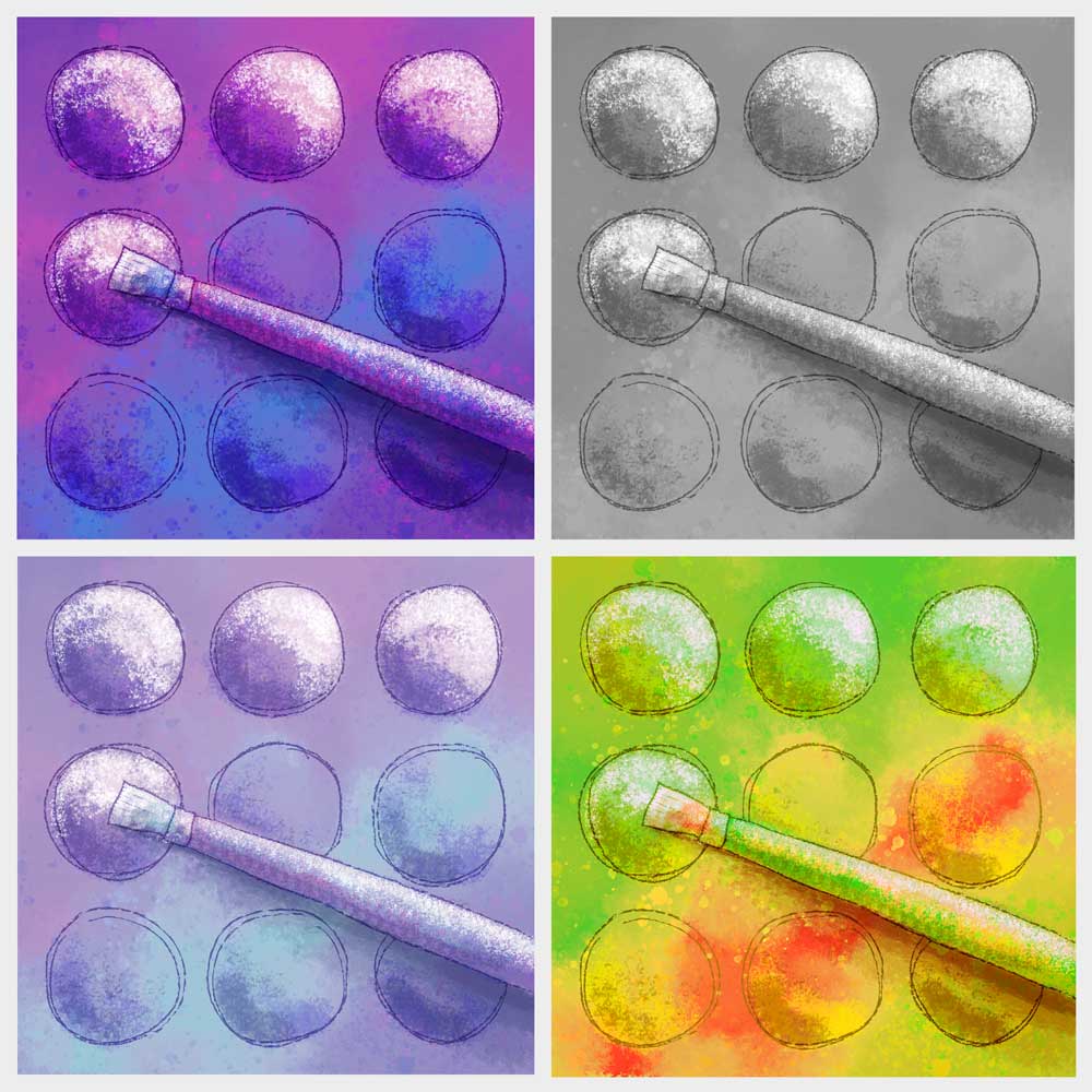
Created a new quilt design for a challenge to illustrate a favorite quilting tool. I have chosen a paintbrush, because I love to combine my art tools with my quilting. Decided to try it out first in a digital format. Started with my "safe" colors (bright purple and blue) then tested some other colorways. I can't decide which I like best. Which one is your favorite?

Wednesday, July 20, 2016
Photographing Pins
 This weeks photo exercise was a bunch of sewing pins and a magnetic pin holder.
I photographed them at different angles and with varied lighting. Adding a "Poster Edges" filter in Photoshop gave these designs more of a graphic quality. I think the filter takes it one step away from reality so the pattern is noticed more and the subject less.

Wednesday, July 13, 2016
Finding Patterns in Ordinary Objects
Picked up this book on impulse from the library a couple days ago.

Just flipping through a few page inspired me to find my own patterns and look at ordinary objects in a new way. https://patternity.org/ whole organization dedicated to pattern research. Plus it is a way for me to improve my photography skills. Here is the first in my series of pattern photographs. Can you tell what it is?

Friday, March 11, 2016
Completed Pieces for Fiber Shots
Here are the completed pieces I created for Fiber Shots at the San Jose Museum of Quilts & Textiles. Fiber Shots will be sold to benefit the museum for $100 each. It begins today in concordance with the Kaffe Fassett exhibit.
Linking up to Nina Marie's Off the Wall Friday.
 |
| "Fruit Salad"; 10 x 10 |
 |
| Untitled; 10 x 10 |
Linking up to Nina Marie's Off the Wall Friday.
Monday, February 29, 2016
Quilt Facing Tutorial
It's time to face the two quilts which are ready to be quilted and finished. This is my variation on a method which is sometimes called the "pillowcase method". I will show the finished quilts in a few days.

Layer the quilt top on top of the batting and do enough quilting to hold the batting in place. For this quilt, I am doing some raw-edge applique at the sames time.
 If the finished size is important, mark lines for the finished size on the front of the quilt. Trim a little more than a quarter of an inch away from the edge. I don't use a ruler or a straight edge since I am pretty good at guessing seam allowances, and I prefer the organic edge I get from freehand cutting.
 You may want to mark the top of your quilt before this step. Lay the top face down on the backing (right sides together and put a single pin in the center. Beginning in the middle of the sides, scoot the edge of quilt front and batting toward the center an eighth to a quarter inch then pin. Repeat for each side, then do the same for the corners. The idea is that you want the backing to be a bit smaller than the front so the seam on the edge will roll to the back. Test to see if the backing has enough stretch to ease stitch the edge together without creating any creases in the front. take out some fullness if necessary and add more pins if you like.
 Stretch the backing as you sew all the way around the edge with a quarter inch seam allowance. Be careful to keep the batting even with the front edge as you sew.
 Trim the backing fabric, and cut the corners to remove bulk when the quilt is turned.
 Cut a strip of fusible web an about an inch wide and a few inches shorter than the width of the quilt. Fuse it where the sleeve will be sewn on later. Make sure you know which way is up, and fuse it near the top edge. Pull the backing away from the quilt front and cut a slit in in it to make an opening for turning.
 I use a slightly blunt pencil as a turning tool. Place the tip of the pencil right at a point, and pull the backing fabric over the tip of the pencil. Repeat for each point. Then turn the whole quilt right side out. The pencil trick usually does a good job, but use a blunt needle to finish pulling out any points which don't look sharp enough.
 Roll the seams to the inside while you press the edges. If you don't have paper on your fusible web, then avoid ironing over it until you have ironed the edge completely.
 Everything should be looking pretty flat at this point. Remove the paper from the fusible web. Press the fabric above the slit to fuse it to the batting. Smooth out any wrinkles in the back and press the rest of the slit. If the edges of the slit don't line up perfect, it's not a problem since your hanging sleeve will be sewn over the top when you've finished quilting.

Layer the quilt top on top of the batting and do enough quilting to hold the batting in place. For this quilt, I am doing some raw-edge applique at the sames time.


Wednesday, February 24, 2016
Auditioning Backgrounds
I cut the subject out from the background on this piece. The light colors were blending too much with the background fabric.
Spent too long on creating a new background before I decided the medium values are blending now. And the intricacy of the background is competing with the foreground.

I think I am like this simpler darker background much better.
 See what everyone else is up to on Nina Marie's Off the Wall Friday
Spent too long on creating a new background before I decided the medium values are blending now. And the intricacy of the background is competing with the foreground.


Saturday, February 13, 2016
The "Fruit Salad" saga continues

Linking up to Nina Marie's Off the Wall Friday.
Saturday, February 6, 2016
Re-purposing Some Older Work
The San Jose Museum of Quilts & Textiles is asking for donations of 10 in squares fiber artwork to be sold to help with funding. The "Fiber Shot" sale will be held in conjunction with the Kaffe Fassett show beginning March 11th.
Thinking about what I could do to participate, I dug out some old design exercises which have been sitting in a box for 10 years. Two sets of identical shapes were cut freehand to make a still-life. The second set of shapes was re-arranged to create an abstract composition.
 I've been uninspired to do anything with either of the pieces. The first still life was fun to make, but lacks any imagination and didn't hold my interest, so I made some sketches, and decided to cut it up and make "fruit salad". I cut it up before I could change my mind, so now I'm committed.

Thinking about what I could do to participate, I dug out some old design exercises which have been sitting in a box for 10 years. Two sets of identical shapes were cut freehand to make a still-life. The second set of shapes was re-arranged to create an abstract composition.


I plan to cut it into smaller irregular squares and mix it together with some greens and purples. The other piece may just get some borders added.
Monday, August 31, 2015
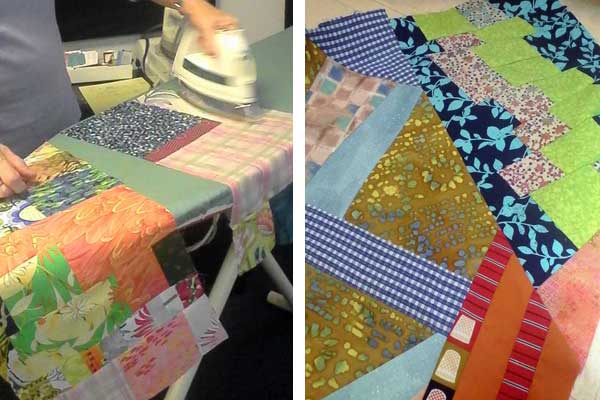
Improvisation - part 2
I took a second look at the "round robin" quilt I came home with from the cqfa meeting
a few weeks ago. There was a large green rectangle that was drawing too much
attention in the original, so I trimmed it down into smaller pieces and redistributed
them. Added some more of the blue print fabric, and continued the black
as a border. Need to decide how big I want it so I can finish the
piecing.

Monday, August 3, 2015
Improvisation with Friends
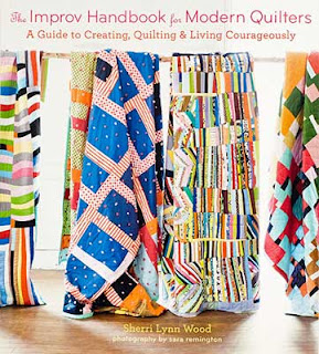
Saturday was spent at a meeting & workshop for Contemporary Quilt & Fiber Artists (CQFA). In the afternoon nine of us did a "round robin" inspired by a chapter in Sherri Lynn Wood's new book:
We each began by selecting fabrics from our collection to set the color scheme, and made a quick pieced block from some of the fabric. A strict fifteen or twenty minute time limit kept us from overthinking the process.

Our baskets of fabric (all except one signature fabric) and the block we worked on were rotated to another person. We then added some pieced work using the fabric given to us plus our own signature fabric.
As the quilts progressed we were encouraged to see what the quilts had to say and "add to the conversation" with our own piecework. We were given a little more time with progressing rounds as larger pieces needed to be completed. Thirty minutes for the last round and to "complete the conversation".

There were no great masterpieces, but each quilt was attractive and unique, and we all had a sense of accomplishment in a relatively short time. It will be fun to add a bit more piecing to balance the design and enlarge it to the size I want.
Monday, July 27, 2015
Design Internship

Our first assignment was to create a digital announcement in our own style. I created a pencil drawing which I scanned into Photoshop. It was "painted" in Photoshop using the Brush and Mixer Brush tools.
Saturday, May 24, 2014
A lesson in “Hand Written” fonts
I had an interview for a summer internship yesterday, and got some great advice on the font choice used on one of my portfolio pieces.
For my final project for a design class, I chose to do an ad for my favorite pair of sandals. Since hand drawing at least part of the ad was a required element, I had the idea to create the ad around a woman who likes to hike, and likes to write and draw in her art journal. Nearly all of the text for the ad was written in the journal, and I chose a font called “Segoe Script” (shown in left sample below) because it looked like hand writing, and would give the casual feeling I was trying to achieve in the advertisement.
 The problem with using a font to represent handwriting, is that it’s a little too perfect. Escpecially for large amounts of text with repeating letters, it’s quite obvious that it was typed on the computer. It’s usually better if you want to represent handwriting to actually write it out by hand (right sample).
I’m much happier with this project now that I’ve made this change. The images I created are all black and white drawings which I scanned into Photoshop. I used the Brush tool and the Mixer Brush tool to “paint” the images in Photoshop. This was the first time I used the Mixer Brush tool, and I found it to be alot like blending two colors of wet paint together with a brush.

For my final project for a design class, I chose to do an ad for my favorite pair of sandals. Since hand drawing at least part of the ad was a required element, I had the idea to create the ad around a woman who likes to hike, and likes to write and draw in her art journal. Nearly all of the text for the ad was written in the journal, and I chose a font called “Segoe Script” (shown in left sample below) because it looked like hand writing, and would give the casual feeling I was trying to achieve in the advertisement.
I’m much happier with this project now that I’ve made this change. The images I created are all black and white drawings which I scanned into Photoshop. I used the Brush tool and the Mixer Brush tool to “paint” the images in Photoshop. This was the first time I used the Mixer Brush tool, and I found it to be alot like blending two colors of wet paint together with a brush.
Wednesday, May 21, 2014
Rowell Ranch Rodeo Parade
A couple of weekends ago I went to the Rowell Ranch Rodeo Parade in Castro Valley so Camilla could hand out tote bags and flyers for her school. I went with my camera to take lots of photos and get inspiration for a final project for my Photoshop class. I got frustrated trying to put many photos together to represent parade and community and not just the rodeo. My initial efforts looked very cluttered and busy, and didn’t have any focus.
Going back to planning stage, I decided I could make an effective poster with just words. I picked a simple background drawing, and then focused on how to arrange the words for good visual impact. The parade has been around for over 90 years, so I had the idea to make a vintage looking sign. I gave it further character by placing a photo of some old boards you might find on an old ranch (actually my backyard fence) behind the image, and then blending the two with many layers.


Going back to planning stage, I decided I could make an effective poster with just words. I picked a simple background drawing, and then focused on how to arrange the words for good visual impact. The parade has been around for over 90 years, so I had the idea to make a vintage looking sign. I gave it further character by placing a photo of some old boards you might find on an old ranch (actually my backyard fence) behind the image, and then blending the two with many layers.
Friday, May 2, 2014
Inspire Oakland Billboard
I was excited to find out last night that my billboard design for ODALC’s Inspire Oakland program won 2nd place. You can expect to see it on a billboard soon.

For my design, I decided to focus on the view from Arrowhead Marsh located in Martin Luther King Jr. Park near the Oakland Airport. I imagined viewing the distant skyline from the air. Some artistic license was used in bringing the buildings much closer.
Watercolor was used to paint the view in a stylized way with bright hues, and I allowed the distant downtown to blend into the bay and marshland below. I created a second painting of my hand lettered text, and the two paintings were brought together in Photoshop.
Saturday, April 26, 2014
Anthropomorphic Sketches
Yes, the backpack drawing from last week is meant to represent Minnie Pearl. I was trying to think of a celebrity who had a recognizable personality beyond a character they portrayed. It seems Minnie Pearl was nearly always in character. If you know anything about her, I suppose the price tag was a huge clue.
 This week we drew sketched Anthropomorphic objects. It was fun to look at objects and figure out what kind of human characterics I could give them. As soon as I sketched a foot on the heel of a pump, the top of the heel resembled a hip. I call this a “barefoot” shoe, since the shoe isn’t wearing a shoe.
Putting a face on the head of hammer seemed like an obvious choice. He looks angry. Maybe because his nose gets sore when he’s working.

This week we drew sketched Anthropomorphic objects. It was fun to look at objects and figure out what kind of human characterics I could give them. As soon as I sketched a foot on the heel of a pump, the top of the heel resembled a hip. I call this a “barefoot” shoe, since the shoe isn’t wearing a shoe.Putting a face on the head of hammer seemed like an obvious choice. He looks angry. Maybe because his nose gets sore when he’s working.
Sunday, April 20, 2014
Some Sketches
I have been sketching this weekend for school projects. (Ignore the lines down the middle of each. All were done on very large paper which has been folded and had to be scanned in parts.)
Here is what you would see if you were me looking down at yourself sketching.

 A backpack designed to show the character of a famous celebrity. Can you guess who? I’ll give an answer in my next post.
A scarf designed to represent my own personality.

And a tattoo which is also meant to represent my personality (although I can’t ever imagine getting a tattoo). This one stumped me until I thought about taking similar elements from the scarf and wrapping it around my arm, then it came fairly easy.

Here is what you would see if you were me looking down at yourself sketching.
A scarf designed to represent my own personality.
And a tattoo which is also meant to represent my personality (although I can’t ever imagine getting a tattoo). This one stumped me until I thought about taking similar elements from the scarf and wrapping it around my arm, then it came fairly easy.
Tuesday, April 8, 2014
Oakland Watercolor Painting

Sunday, March 23, 2014
Going Bananas Revisited
I used parts of my last quilt in a Photoshop collage for my Photoshop class.

I began with a photo I took in Garin Park up in the Hayward hills. A hand drawn door was “painted” in Photoshop which opens into an alternate universe where quilted monkeys are trying to reach the bananas. The open door has drawn the quilted alligators out from hiding. The squirrel and the sky behind the monkeys are public domain photos I found online. And the sunbeams coming out from the door are a vector illustration I drew in Illustrator.
It was fun combining these different styles into a new project.
Friday, February 28, 2014
Going Bananas

I am currently using it again in parts in a photo montage for my Photoshop class.
I have linked up to Nina Marie’s Off the Wall Friday.
Monday, February 24, 2014
Talking Typefaces
The purpose of this project is to show how type can communicate just by the typeface chosen. This typeface is called Petal Glyph, although I think it looks more like leaves than petals. It’s interesting how you can stylize a letter this much, and yet it’s still legible.
 I had originally thought I would fill the letters with a photo with Adobe Illustrator, and add a drop shadow, but decided to make it literally dimensional. The letters are cut out of white foamcore leaving letter shaped windows which are mounted a quarter inch away from a solid piece of paper painted with watercolor.
Subscribe to:
Posts (Atom)

